Friday, August 15, 2008

Door: Putting it together

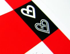
By tiling out our entry door design, we were able to closely examine the details and fine tune the placement of all the elements of our design. 

We visited a few signage companies and found the above colors to be the ones that closely matched our color palette.


Mug: Final Design


This year, the school of design will give each student in the department a mug. This is the final design that we've created that incorporates our icons. 

Wednesday, July 16, 2008

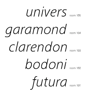
Signage: Classroom Type Treatment


These are the door signage tags. We would like these to be cut in vinyl and applied directly on the wall. Our system allows for each room to have a different color application. The italic type is inspired by the diagonal in our system. The portions of the spacing and scale was derived by the same portions of the icon system.

Signage: Explorations


Tuesday, July 15, 2008

Signage: Door Sketches


Door signage ideas: We would like to have large vinyl signage on the doors to represent their function. The door identification would be functional and practical. Playful applications of our icons, such as pattern, would appear inside the places. 

Thursday, July 10, 2008

Grid: Structure


The grid structure that will be used to organize text and images was inspired by a poster designed by Hans Allemann, a graphic design professor at KCAI during the 1960's. The vertical lines on the grid are slanted 5 degrees to remain consistent with our diagonal element. 

Sunday, July 6, 2008

A conversation with Carl Kurtz


Above: Proposals for the Kansas City Seal by Carl Kurtz

We met with Carl Kurtz, a former student of Roy Roy Kelly and a former teacher of ours. He is a brilliant story teller, craftsman, educator, artist, designer and the list goes on..and on..and on. As always, we found his words educational and inspiring. Talking with him was one of the highlights of our summer.  If you have ever had the privilege of talking with Carl, you would know that not only does he inspire you on the particular project you are seeking his advice for, but, his words can be applied to other aspects of your life. We came to seek advice for our idea, but we received so much more. 

Here are some of Carl's suggested reading + viewing 
to help inspire our project:
79 Short Essays on Design by Michael Bierut
The Cheese Monkeys by Chip Kidd
The Learners by Chip Kidd
Mutiny on the Bounty (preferably the Marlon Brando version)

more to come...


Discovery


Look what we found!

Icons: Final


Icons: Development


Graphic Element: Swiss Diagonal


Above: Poster Design by Joseph Muller Brockman and Herbert Matter

Graphic Element: Diagonal


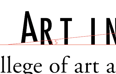
We wanted to have an element that would brand all design pieces together. We decided to use a template that would incorporate our existing school identity in this project along with the commonly used diagonal in Swiss design. In the two line signature, the angle of the A in art, is off by 5 degrees from the baseline. All the design publications will make use of the 5 degree angle, shown above.